Satya Juice / Brand Identity & Packaging System
CLIENT: Satya Juice ROLE: Creative Director AGENCY: Yuri Shvets Design
Satya, a quirky and soulful cold press juice manufacturer from Philadelphia, came to me with a large branding problem. I've learned that a cold press technology as a healthier method is no longer a unique differentiator in this overcrowded market arena. To compete effectively against others, we positioned Satya not just as another cold press juice, but rather as a superior health and wellness brand that educates and inspires people, who are on their path to more wholesome lives. By combining the ancient eastern philosophy and a highly effective modern western technologies Satya commandeers people’s transformation into a better and healthier versions of themselves.
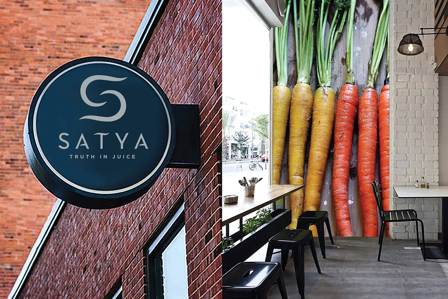
Satya is the Sanskrit word for truth. As great and meaningful name as it were, the word "Satya" sounded too esoteric to the contemporary American consumer. Hence, there was a need for a hard-working logo that could convey Satya's essence in its purest form. I've designed a symbol based on two juice drops that mix together and form a letter "S". This bold iconic shorthand instantly communicates the energy and life-transforming qualities of Satya brand. It also suggests a life lived in perfect balance.
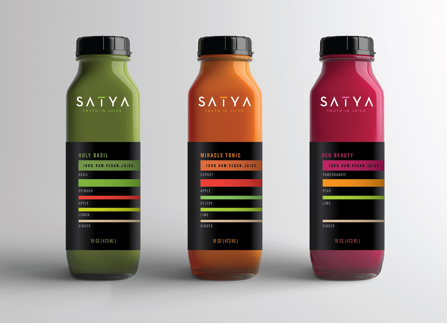
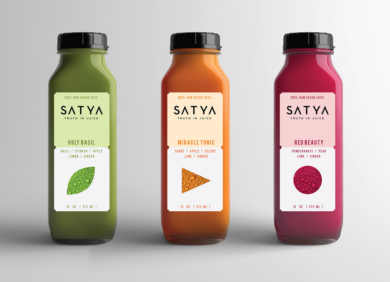
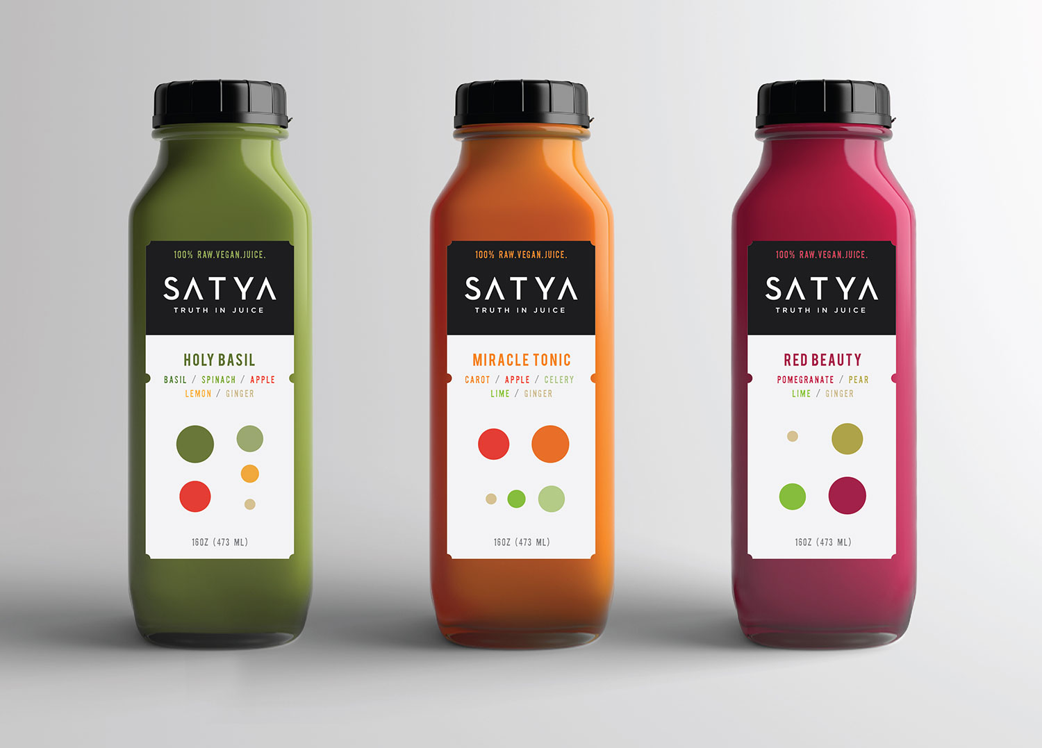
In addition to the brand identity, I've developed an elegant and distinctive packaging system. Its design is both modern and timeless, western and eastern, thus suggesting that Satya Juice is superior because it combines the best qualities and methods coming from both worlds.
A word from
my client...
"We'd been looking for a graphic designer for months, but the few ones we connected with never seemed able to meet our vision.
Finally, we discovered Yuri Shvets Design.
In addition to Yuri’s tremendous creative talent, the real difference was that Yuri LISTENED to us. He heard what we wanted and created logo and packaging that perfectly fit the image and story that we were trying to convey to our customers. We recommend Yuri unequivocally and we plan to hire him on future projects."
- Erika Ianoale, Founder of Satya Juice


