Stolen Youth / Identity & Awareness Campaign
CLIENT: Stolen Youth ROLE: Design Director AGENCY: Hornall Anderson CD: Jack Anderson
A new local nonprofit leading the fight against child trafficking came to Hornall Anderson with a logo request. They needed a bold identity to galvanise public action and win more sponsors, yet their name—albeit extremely powerful—lacked a much-needed sense of hope.
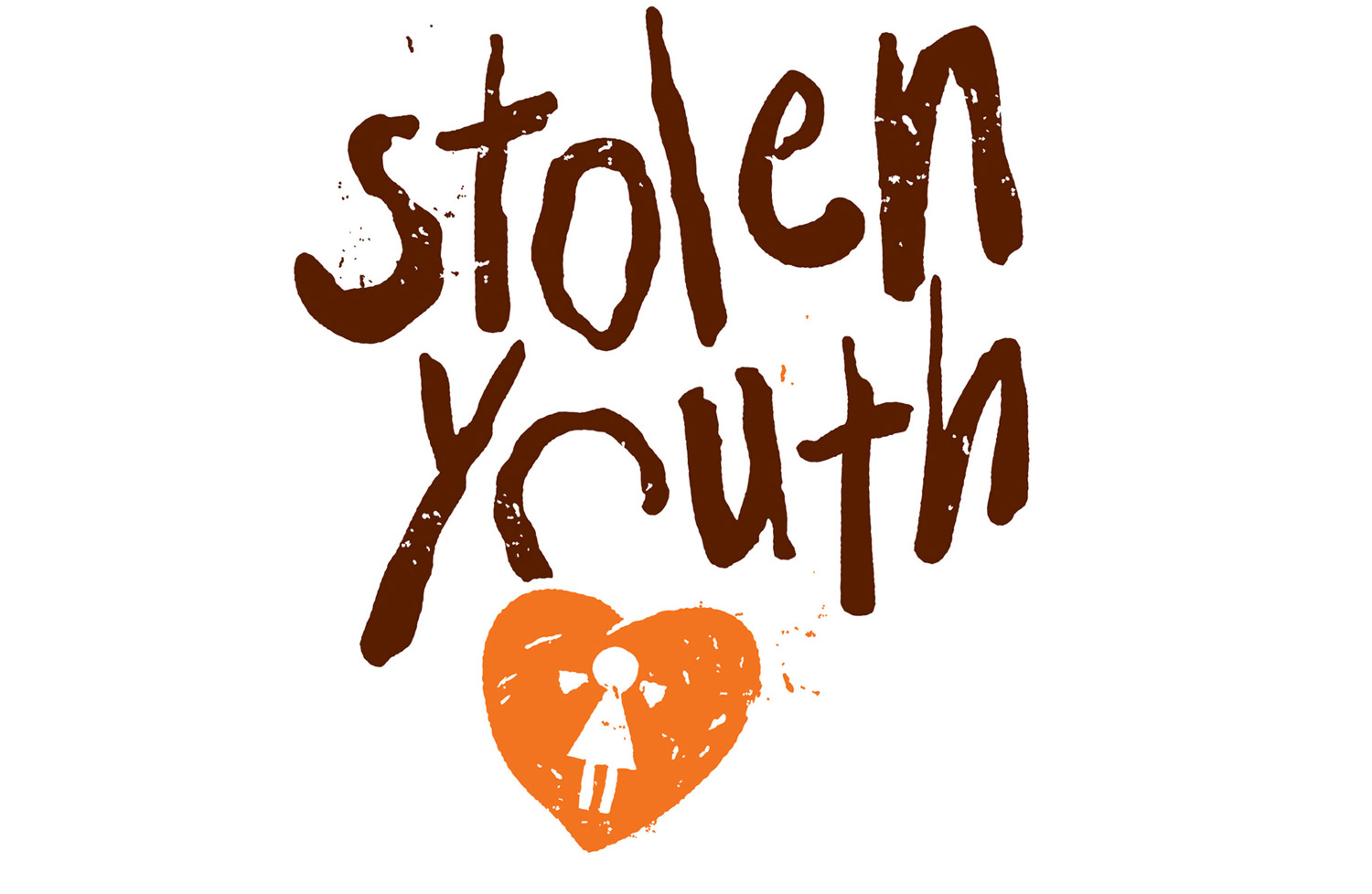
I created a dual metaphor in the image of a broken locket symbol with a keyhole resembling a little girl to express both the problem and the hope for a solution. The positive emotional drive of the new identity was fully embraced by Stolen Youth. I was heartened to hear that the company raised over 700K during its first business luncheon.